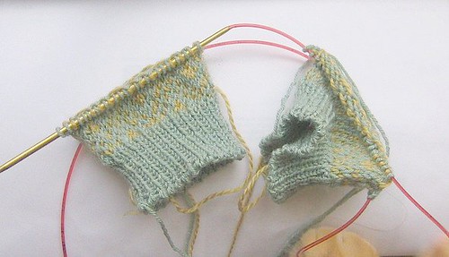
Ah! I’m frustrated. I started these mitts loving the colors side by side, but I’m not sure if I love them in the pattern. I need opinions. Does the yellow get too lost in the pattern, or is it ok? I might switch it out for the gray shown a few entries ago. I could just rip back all the patterned section and replace the yellow with the gray. I hate to do that though. I guess this is what I get for cheating on my February lady.
I’m just about to finish the body of the February Lady. I’m trying to decide how long I want it. I usually like long sweaters, but it seems like so many of the swing jackets and sweaters are really cute when cropped.
Seymour was helping me to adjust the mitts. You can see his paw and the tip of his nose in the picture. Cats are really helpful with yarn and knitting projects most of the time.


From experience (I made my endpapers with dark blue and brown), I would go for colors with more contrast. If you’re gonna spend all the time on the color-work, you want it to POP!
to be honest, I would go for more contrast. i think the colors would look great striped. and grey + yellow = LOVE.
Ok, I like the mutedness of them a lot, but I can see how you might want them to ‘pop’ more.