I’m very excited to start a New Girl Knitalong with Angela on Friday! I received my Gaea Sport from Blue Moon Fiber Arts on my lunch break, and I’m mulling over my options. I planned on using Everyday Grey with either Sunstone (orange) or Marina as a contrast. I thought this would be a snap to decide when they arrived, but I’m still struggling. Thoughts?
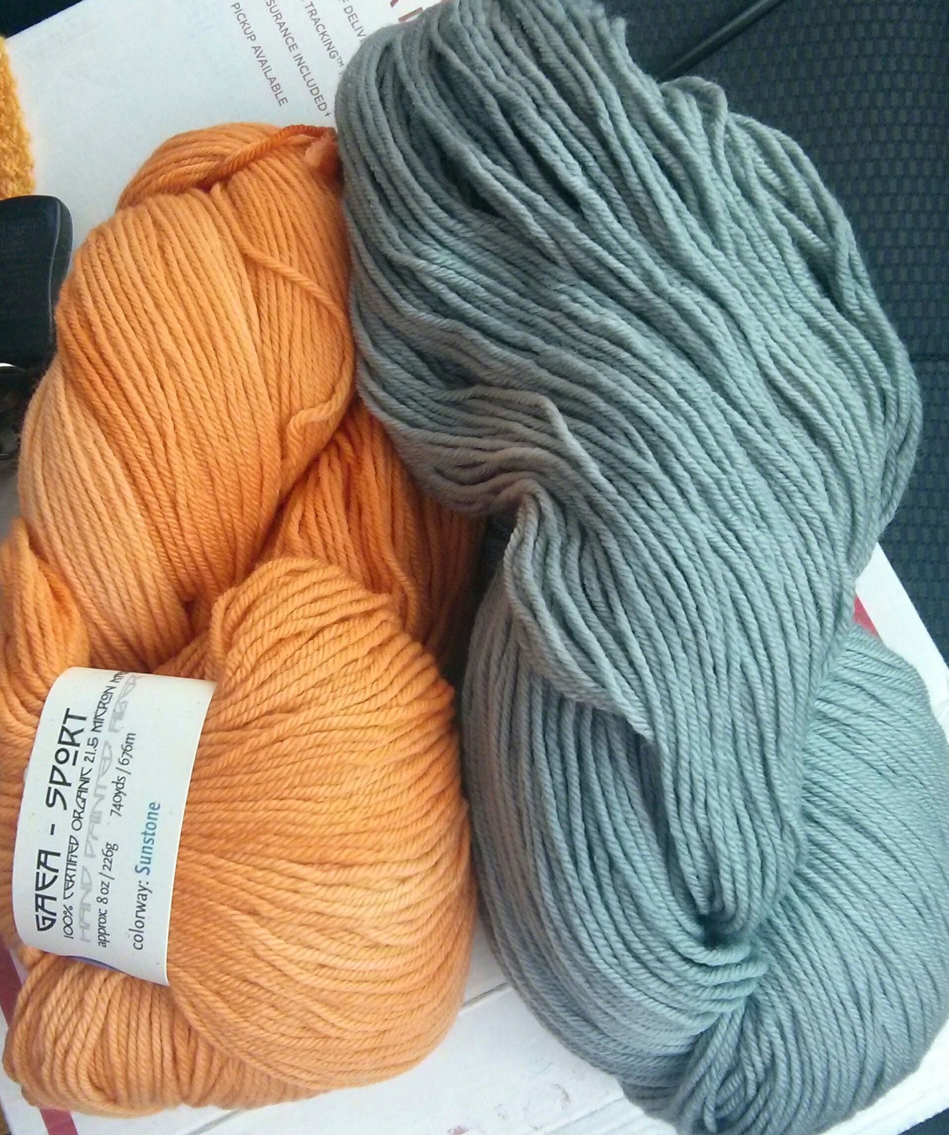
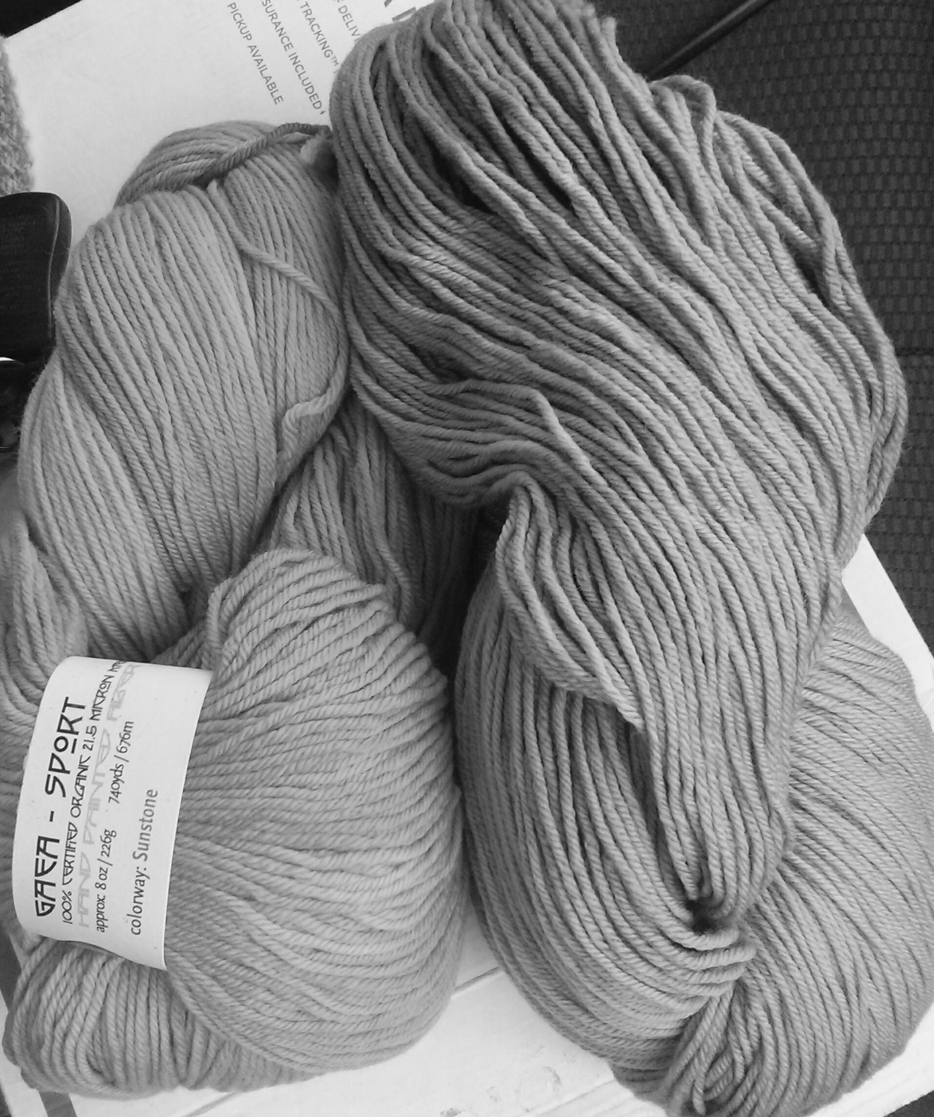
These are just some phone pics, since I’m too impatient to wait for nicer shots when I get home. The first two pics are Sunstone/Everyday Grey shown in color and with it’s black & white version for color contrast comparison. Everyday Grey/Marina are the second two shots.
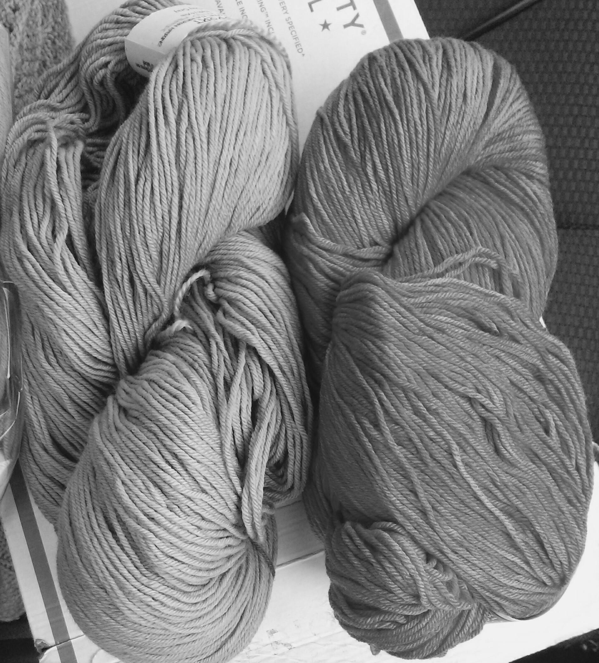
The Everyday Grey/Marina has a little bit more contrast, but I’m somewhat stumped. The colors are a little different from what I was expecting when I ordered them online, as these things always go. I expected the grey to have less of a blue hue to it and the Marina looked much lighter. The Sunstone was also crazy bright, and I was expecting it to have a little more retina shock in person. I’m a little disappointed that they came out so differently. Thoughts?

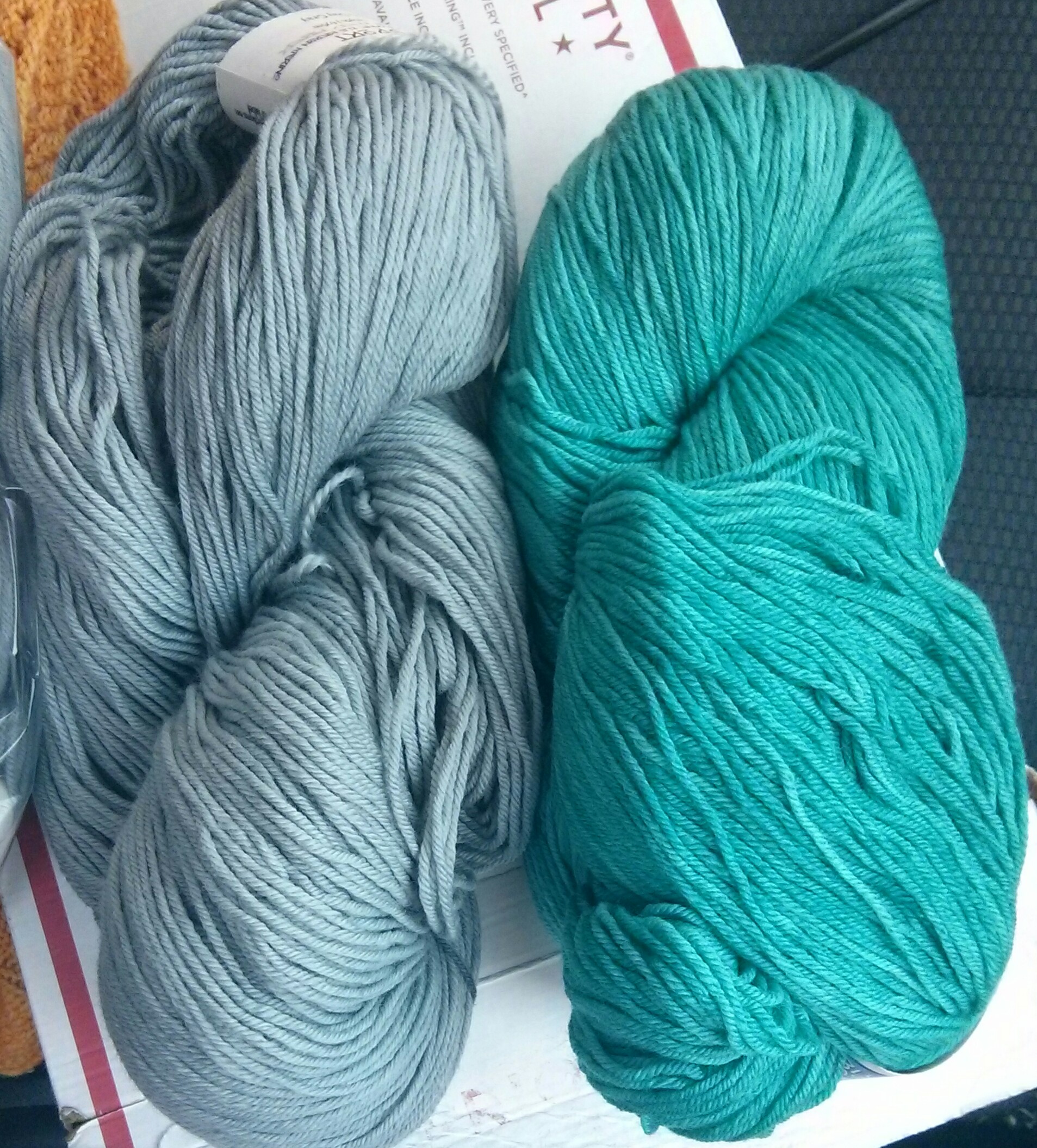


I like the blues together. They may not be super contrasty, but they would look awesome.
Grey/Marina is my vote. They look great together
What a fabulously difficult choice.
Hmm…I would choose the colors from opposite sides of the color wheel, blue and orange, even though they have less contrast.
I love the Sunstone/Everyday Grey combo.
Oh goodnessI am going out on a limb. Not sure what effect you are looking for but I am thinking the Sunstone and the Marina look nice together and would really pop..
That would be beautiful, but it’s not an option. I only have enough of the grey for the main color in the pattern.
Well for sure the Sunstone! I has a nice warmth to it and will be awesome!
Sunstone Marina. There is a calming affect for me with those two ‘ocean’ colors!
I agree with Jo on the colors. Marina and Sunstone would be a lovely, vibrant combination!
I’d go Sunstone/Everyday Grey for some reason? A little more out there, but the blueyness of the other pairing is a little too samey. I like the stronger contrast. And I feel you on ordering yarn online only to find the actually colour to be a little ‘dead’ in real life.. not sure how to combat that except to buy from LYS!
I say Sunstone/Everyday Grey….I really like those two colors together!
I’d vote for Sunstone (which surprises me, because I’m rarely in an “orange” mood), but when I think of New Girl, I think of bright colors.
Good luck choosing!
Depends on what look you are going for…the Sunstone/Grey will be more fun and flirty, the Marina/Grey will be more subdued. I vote for fun and flirty!! Good luck deciding. 🙂
I’m always disappointed when colors don’t match the online shots. I think I like the grey/marina best.
I can’t decide on any of them. They are all beautiful!
I agree with you about the colours. When you sent me the links I definitely thought Sunstone would be super bright and Marina would be softer. I was kind of leaning toward the Grey/Orange before, but given the way the colours are in person, I like the Blue/Grey combo. But, since that’s what I’m doing (with opposite dominance), perhaps I’m biased?
I wonder if you could squeak it out with Marina and Sunstone alone. Maybe do a contrast waistband?
This yarn is definitely more like a DK than a sport weight. I’ll have to see what a gauge swatch looks like and go from there, but I think I have a greater chance of wearing this if I pick one color… Decisions!
So many decisions! But yes, definitely wearability is the key. I can’t wait to see what you choose 🙂
I’d go with the sunstone, for sure. Too bad you haven;t enough of the marina to go with it, because that would sure be a bright cheerful skirt! But the gray will still look pretty.
I love the grey with the marina. What a beautiful skirt and it will look so cute on you. 🙂 Can’t wait to see it finished.
Sunstone and Grey .
I think I prefer the Everyday Grey / Marina option. They seem a little more tonal seen as how the grey is quite blue. Can’t wait to see the finish skirt. I am tempted to give it a go myself!
I’d go for all but the second one – that seems like too little contrast, but maybe you’d want to swatch some combo’s first, to get a better idea of the effect ? When in doubt, maybe let it depend on what you aim to wear with it ? If you have very bright shirts ( and leggings ), go for the grey combo, something like that…
The everyday gray and marine have more contrast, but they don’t look “right” together to me for some reason (based on my computer screen, though). I think it’s because the gray has so much blue in it, the marine is bringing out even more blue; and the pairing looks strained to me. If the everyday gray was muted or more neutral, it would look right with marina. Everyday gray looks much “grayer” next to the sunstone, so I vote for everyday gray plus sunstone. Summer is coming, and orange is much happier, anyways.
I’m with Allison…loving the Sunstone 😉
Sunstone/Everyday Grey. Sunstone is definitely a warm weather color – I’m sick of winter! Also, I think that the blueness in the Everyday Grey goes well with the orange. 🙂
The Sunstone/Everyday Grey looks like a better combination to me. Even though there is more of a contrast between the other two, they are too similar in color. It gives almost a “clashing” effect. The blue tint to the Everyday Grey makes it a complimentary to the orange of the Marina which should overcome the similarity in their tonality and make the colors pop more.
I would go for the sandstone/marino cause I would love to wear a bright top on it as well 🙂